I Need to Put Up More Walls
Back to list
I Need to Put Up More Walls
September 27, 2026
I recently revisited two of my grandfather's paintings and fell back down the film rabbit hole, which works nicely with the printing rabbit hole I'm already in. I'm running out of wall space.
I've become as addicted to making prints as I have to feeling stress. My grandfather, Angelo John Grado, was a prolific painter. After he passed, he left thousands of paintings in his basement that all found new homes. I grew up seeing his paintings on the walls of my house and my family's houses. So I was constantly surrounded by paintings and canvases, physical pieces of art that changed depending on the angle you looked at them. They looked different whether you were coming from the kitchen with a slice of pizza or coming from the living room after your dad thinks you sat on the remote during The Sopranos finale.
Like I said, my grandfather had thousands of works in his Brooklyn brownstone. Maybe one day soon I'll talk more about all of them, but for now I'll mention two that were always standouts.
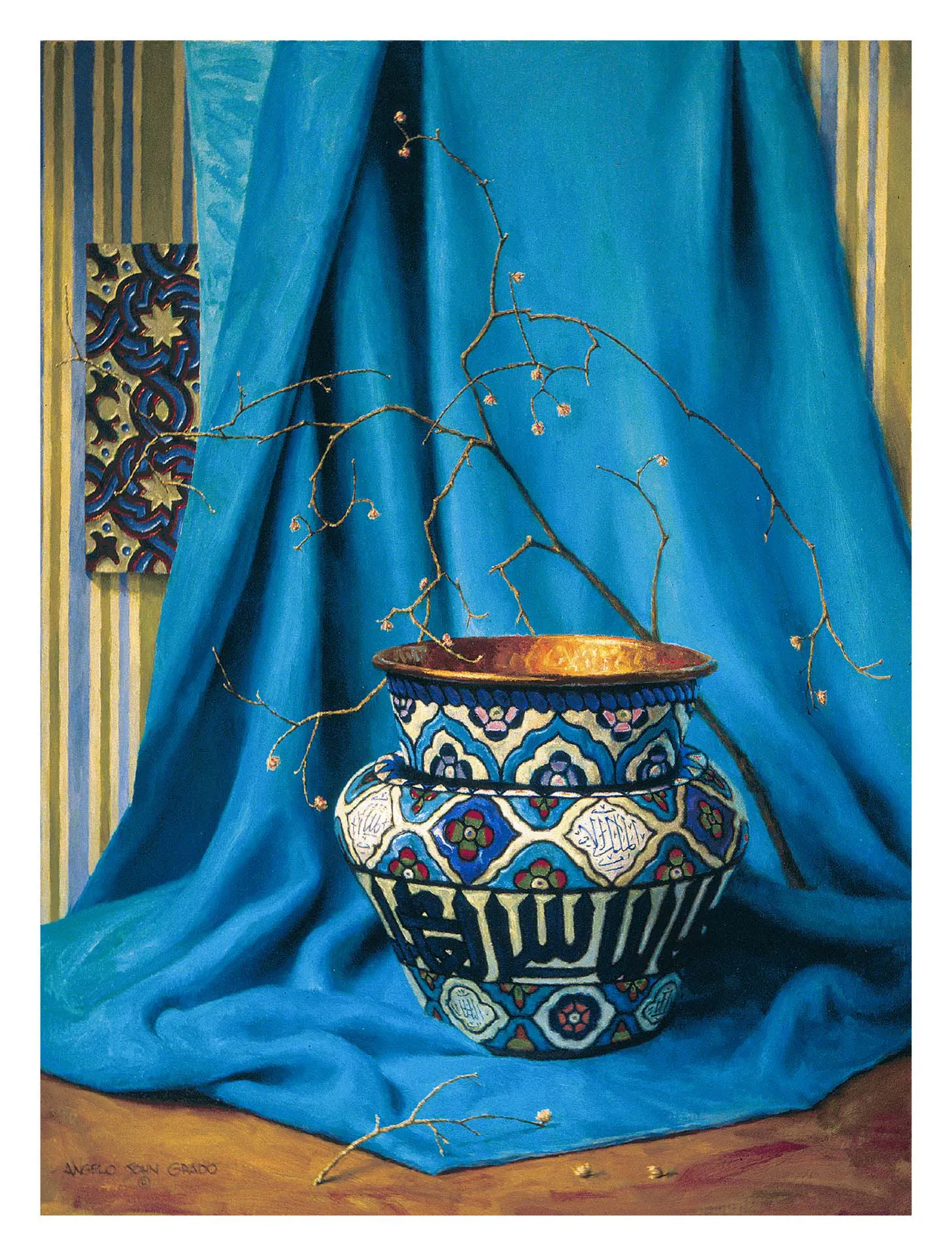
This is Composition Blue, what I think is almost everyone in the family's favorite. My brother even has a small tattoo of this vase. This is a very large painting, and it lives in a very ornate and intricate frame. But it still doesn't take away from the painting itself. Interestingly, this painting never stood out to me like it did to others growing up. It wasn't until I started shooting still life that I really started to appreciate it. Maybe seeing it in my periphery throughout my childhood left an imprint on me, seeing as I always had blue velvet on my mind.
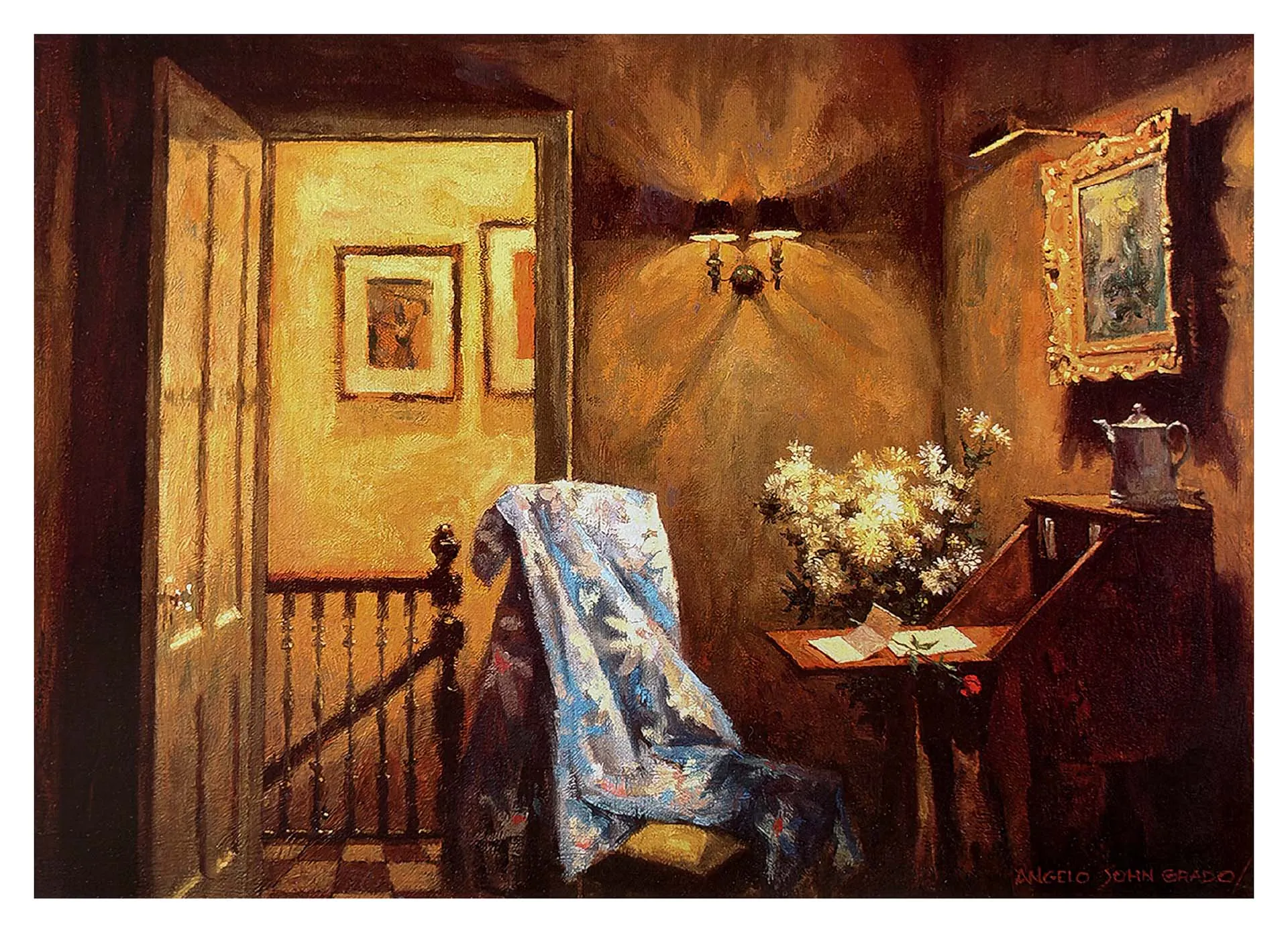
This is Love Lost, and even its walls are filled with frames. It was always one of my favorites. After Sunday dinners, I'd run through the house and end up stopping to stare at this one. Maybe subconsciously I liked that it showed an ending and you had to invent a beginning on your own. Or maybe I was just too full to keep running. Getting across your artistic vision while leaving room for observer interpretation is easier said than done.
I bring all this up to say I grew up surrounded by work I could walk past and even trip over, which I did all the time. So when I started making photographs I cared about, printing felt like a natural extension of the process. I wanted to take up my wall space.
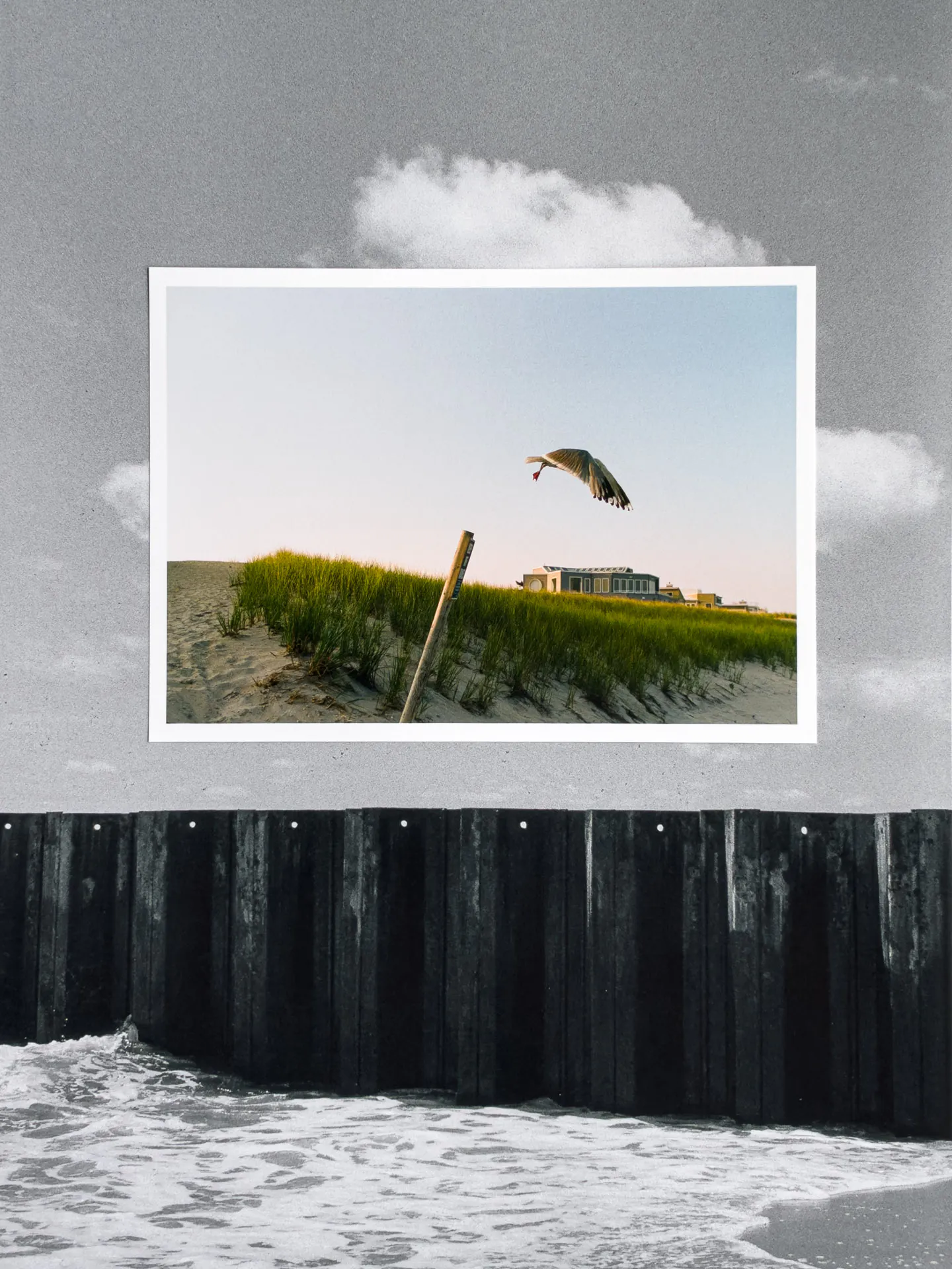
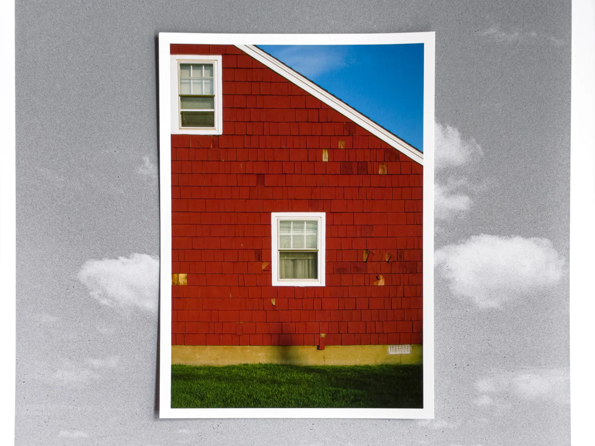
Scattered through here are some new film photographs from Long Beach Island, printed at 5x7, 11x17, and 13x19 on Polar Matte 230.
I've printed and framed a few pieces over the years, working with printers in Austin and Brooklyn in the process. But these were for either 36-inch or larger pieces, or UV prints on materials you can't easily print on at home. I decided to look into nicer at-home printers when I ended up finding a printer my brother had bought and never used tucked away in storage. Coincidentally it was the exact printer I had been researching, the Epson EcoTank Photo ET-8550. Short name. Predictably I became obsessed, found the paper I'd want to use, and ended up doing a Q&A with the paper company I had been using, Red River.
Interview with Red River Paper
A few months after printing nonstop, I had the pleasure of doing an interview with Red River Paper. In Success on Paper: How does this Brooklyn photographer turn the surreal into cinematic fine art? Red River asked about my focus on surrealism, why I shoot my work the way I do, and what specific papers I use. Red River and I connected after I had started using their paper for all my prints. These prints are for myself and for anyone I work with, something to remember the shoot by.
Picking the Paper
I started with a sample pack of paper and printed the same grid of photos on each one: a mix of black and white, color, deep shadows, extreme highlights, people, plants, lots of grain. After going through and overanalyzing every print, I landed on four favorites.
Palo Duro Softgloss Rag became one of my favorites. To me, it's a hybrid of matte and luster, with a texture that makes the tones come out exactly how I want them. Polar Luster Metallic changes the most depending on the light, since there is a shimmer that always looks a little different. Arctic Polar Luster and Polar Matte 230 round out the four. They're the ones I'll use when a photo should be cleaner and less showy than the other two (all the film prints on this page are on Polar Matte 230).
I am by no means an expert in any of this. I'm still learning to pair photograph to paper to matte to frame. I saw William Eggleston's The Last Dyes, an exhibition on his dye-transfer prints, at David Zwirner and couldn't stop thinking about how perfectly all the pieces went together but still let the image shine. At this point when I want to print a photo, I do immediately have a paper come to mind, but that doesn't stop me from experimenting with whatever paper is in reach. Where's the fun in that?
If you're curious about the printer or the troubleshooting I had to do to get it running smoothly, I put some things I learned below. Maybe they'll help someone else.
Getting the Epson 8550 to Work
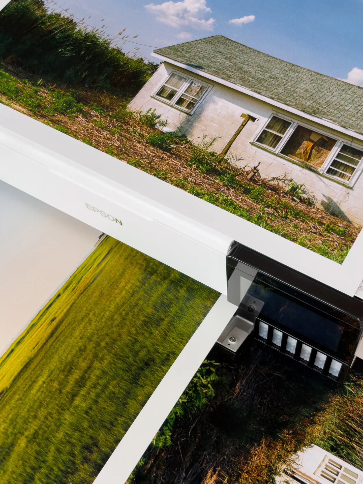
Epson has their own printing software which does work well, but the following is from me using the Epson 8550 with Lightroom Classic.
When you first connect the printer, it'll automatically download a printer driver. After this, completely ignore it and go to Epson's site to download the updated drivers manually. You'll know the difference because one will say AirPrint and the other will not. Use the one that doesn't say it.
I print an equal amount of black and white and color photography. In the Print panel in Lightroom on the bottom right, you'll see a section that says Draft Print, Profiles, etc. For my tastes, I prefer to use the paper company's given profile for each paper type for color photos, and auto black and white for black and white photos. Basically if it's color, the profile dictates small tweaks to make to the print. And if it's black and white, I turn off the profile and let the printer deal with it. This is personal taste, and I recommend experimenting with different settings and marking them with exactly what you did so you can make comparisons yourself.
Lastly: printing from the rear straight-through feed. This caused some problems because I couldn't figure out how to tell the printer that's where it should take the paper from. This printing method is recommended for thicker and heavily textured papers. In the Lightroom Print panel, on the bottom left, you'll see “Page Setup…”. Here you'll want to click Paper Size, select the paper size, and pick the option with “(Rear Paper Slot)”. Only one piece of paper can go through the rear feeder at a time, but this should help you avoid pizza wheel marks.